With that said, let's go..
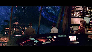
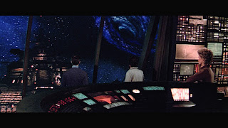
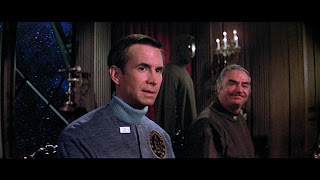
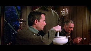
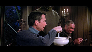
Below are before/after samples of some of the corrective work. I expect this was something which would've been easier to do with the full version of DaVinci - the team at Blackmagic Design actually released a more helpful masking feature in the paid version even as I was working on the project. As it was I had to make a lot of semi-automatic selections and this probably made the process a whole lot more protracted than it had to be. In spite of this the results turned out pretty decently if I say so myself. Sometimes the process required exclusive focus on his outfit within the scene; often it was through a combination of isolation and some general scene colour correction.
I believe the film generally held a yellow cast as a result of the film stock of the era. I suppose this can be considered to be either a nostalgic quality or a sign of age, now we have digital or otherwise more neutral film stock. To that end I expect any remastering of material from around that era can be considered either heresy or a remaster.. I noticed the recent 4k anniversary release of ALIEN for example has the best colour master I've ever seen for that film when compared to on set shots. That film has ranged from warmer yellows and greens through to cold blues across various releases - I expect since they made the effort for 4k with it's 10-bit HDR colour grade that it's reasonable to assume this is the "correct" cast. To that end since ALIEN and THE BLACK HOLE are from the same time I opted to consider the on set photo stock to be the "grade", although the film does maintain a certain yellow tinge anyway owing to the creative set lighting of the Cygnus, which makes it a bit of an uneven bunny to handle.
Over the many, many times that I've enjoyed this film it was somewhat inevitable that eventually I'd begin to feel a little irritated with some of the visual issues which exist. Don't get me wrong - the movie was a gem in visual effects for the day and on the whole it stands up remarkably. Back in 1978/79 when this was produced Disney had to contend with the remarkable bar set by the innovations of the team at Industrial Light & Magic, and the inability of Disney to hire their technology into the production forced them to innovate. When you create a tool, which by definition you will know inside and out, the limits and opportunities will be very apparent. In most respects the response to their quandary, the Automatic Camera Effects System (ACES for short) served Disney well and it was a remarkable parallel achievement. Where I have found THE BLACK HOLE to be most wanting these days has been in the more fundamental technical limitations of the time, matters which have been made all the more apparent as movie technology has moved forwards, and in fairness you can't really criticise the efforts and results of the team for this. It's the nature of the beast. What can be done however is to revisit the material and effectively "remaster", a term which can mean many things to different people. In this case, for me, remastering has meant correcting and balancing, primarily the mismatch between matte/live elements.
There are a number of issues to handle when creating matte paintings in the traditional realm, which are quite redundant in the digital counterpart of today. The art of mixing colours in the real world to match the in-camera film shot, especially one step behind exposure and post production, must be exceptionally tricky and I imagine anyone who has worked as a traditional matte artist would probably be the first to say that no one could expect to have a perfect, consistent track record. That doesn't denigrate the artists but merely speaks to the difficulties inherent to such a production workflow. For me to attempt this after the fact without access to the original film elements was always going to be an interesting challenge, and some of the results still aren't as good as I'd like. It's all down to how detailed you wish to get. Even at the end of several runs through there are things I've missed. There are the limitations of your own computer to consider, the knowledge of the software you're using and perhaps even its capabilities, if like me you're running the free version of the editing software of choice - DaVinci Resolve. It's a VERY capable piece of software but I imagine some of the work I did may have been easier or tackled differently if I had the full version (something I want to get one day). Nevertheless having run through the movie a few times tweaking things here and there I feel I managed to cover the more obvious basics, which with THE BLACK HOLE were most notably wire removal and colour corrections. To their credit Disney do appear to have tackled many of the main wire issues with the bluray release but they had missed some which I snagged, and there are some which we both missed (!) something I only noticed when I watched it on the "big screen" in virtual reality recently (it seems screen size DOES make a difference to your perceptions!).
THE CURSE OF TEAL
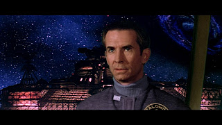
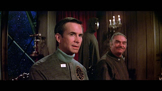
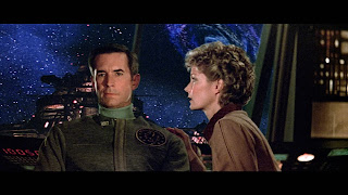
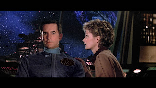
By far the most egregious issue which has plagued my viewing is the constant shift in Anthony Perkins' outfit colour. Given the options available I have no notion of why the costume department would choose blue for a movie which would feature so much blue screen work, but there you have it. As a result you will notice his outfit shift towards teal on occasion. To establish the correct tone I needed to find a scene which showed his outfit as intended, which meant finding a scene which wasn't compromised by blue screen. There are a few so I was in luck. Here's one:
I eyeballed the colour correction from scene to scene, but that was assisted by backtracking and applying the same correction across shots within each scene for an acceptable level of continuity. Thus broadly ends the ballad of the teal outfit. This has plagued me since I first managed to get a few repeat viewings under my belt back in the 80's and it's now a more comfortable experience.
MATTES, MATTES, MATTES
Beyond this it was just matte work, which at times was VERY minimal, to the degree that it's likely only the pedantic side of me that sees the difference and so I won't labour the point with too many examples. There are some however which were pretty significant and worth covering.
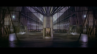
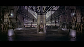
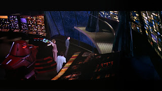
The first was a surprise contrast mismatch and I'm still at a loss as to how they managed to miss this one since it was actually okay on the DVD (!?). It was relatively easy to correct but a mystery as to how it happened in the first place. Since the whole aesthetic of the scene is more towards the "shadowy dark" I opted to use the starfield surround as the base and bring the Cygnus and black hole into its contrast range rather than raising the floor to match the ship.
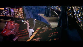
This next one was a bit of a poser since it involved finding an approach to tackling a section of the screen in the room beyond (it's not green in the scene which follows.. at least it isn't now for my copy since it's not green in the rest of the film). The characters both cross over it and was one of the scenes which again involved Anthony's outfit! In the end I used a combination of general correction and a very soft mask in the middle which allowed for manual stripping and smoothing of the green elements - fortunately that played into some of the teal adjustment for Anthony.
More unforgiving blue screen combination work, this time on the air car. My main focus on this was contrast work to help coax the background effects elements and live actors together, but again the scourge of the blue outfit demanded a little additional effort..
I believe this next one was the first scene I played with when I began to consider my options for matte adjustments. It became a bit of a litmus test on how well DaVinci could handle adjustments which required finesse and couldn't count on a convenient sharp edge to hide any discrepancies. In the end it worked out pretty well and set the bar for subsequent scene adjustments. Again, a very slight but noticeable balance to bring the green/yellow shift in the live action footage into the cooler toned effects layers and mattes.
I believe the film generally held a yellow cast as a result of the film stock of the era. I suppose this can be considered to be either a nostalgic quality or a sign of age, now we have digital or otherwise more neutral film stock. To that end I expect any remastering of material from around that era can be considered either heresy or a remaster.. I noticed the recent 4k anniversary release of ALIEN for example has the best colour master I've ever seen for that film when compared to on set shots. That film has ranged from warmer yellows and greens through to cold blues across various releases - I expect since they made the effort for 4k with it's 10-bit HDR colour grade that it's reasonable to assume this is the "correct" cast. To that end since ALIEN and THE BLACK HOLE are from the same time I opted to consider the on set photo stock to be the "grade", although the film does maintain a certain yellow tinge anyway owing to the creative set lighting of the Cygnus, which makes it a bit of an uneven bunny to handle.
Again the next shot called for a very soft and broad brush stroke to bring the subtlety needed. None of the blending is really perfect, but for me if it gets you closer to a shot which looks relatively natural then it's probably a job well done - after all when you watch the film you don't see it when with a side by side comparison. As an aside a great example of a film which succeeds with its effects shots is GONE GIRL. Not a film known for its special effects, you'd be surprised how many and where they are!
This next one is one I'm still fighting with. The shift in temperature and colours between the preceding shot of Reinhardt walking in front of colourful control consoles and this one is unfortunate, and I suspect almost impossible task to balance but taken as an isolated shot the cast difference between corrected and blue screen compensation is pretty clear. Thankfully it's a combination of quick shots. Again Alex does teal! I think I need to work on this some more though since Harry's top has lost its warmth. It's a difficult shot to balance against the background.
A few more subtle touches.. The matte in the top right of the bridge walk scene introduces a touch of tonal balance to better seat the live action shot.
The next was an effort to balance the matte shots for Rob Forster's journey back to the Palomino. It's a pretty complicated combo of pieces to join together and again quite tricky to refine but it balances out reasonably well.
The pallbearer shot following this brings the contrast of the background into better relief and is typical of the kinds of tone adjustments for matte elements.
Of all the shots I've worked on the following was satisfying! Again there's more work to be done to get it perfect, not least of all because Maximilian Schell steps behind a matte overlay at the end of the shot. This could be corrected with a CGI overlay as they did with the re-rendering of Spock on Vulcan for the director's cut of STAR TREK THE MOTION PICTURE, but I suspect it's a bit beyond what I can achieve with the free version of Resolve and is only a momentary thing. For the scene as a whole though toning it in was a delight. If anything I may even be able to push it a bit further..? Maybe next time around.
This sequence was a good example of an attempt at film damage restoration. Here we get what looks like exposure damage of some kind, with the blacks losing out to a blue cast, which just jars against the sombre low key yellow light of the scene. This is a lesser success of all the work I've tried but it has been improved to some degree, and at the level I'm working at I'll call it a win.
The most contentious and difficult sequence to work with throughout the whole project is the shooting gallery. This is absolutely mired in blue screen issues and apparent film damage from start to finish and I'd have to guess there's a fair amount on the actual master. I'm still struggling with this overall sequence and I think it doubtful that I can correct everything satisfactorily with what I have to work with. That said there was one thing which to me was a very forgivable thing given the crunch the effects crew were working under, but something which was I also couldn't "unsee", although I honestly never expected to be able to do anything to correct it.
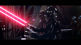
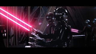
When BOB is chatting to VINCENT about STAR being the prototype, I noticed one day that one of the animators missed a couple of trace lines for the laser shots in the background. The tail end of the shots exists in two camera shots, but not at the barrel end of the deal (see first image). This is the first of the two quick sequential camera shots. I was very happy to discover how to overlay some laser light onto the scene in the "Fusion" tab of DaVinci, using the principle of lightsaber creation as a means to re-creating the effect. These are just stills but watching it in context honestly you'd never know it now, so that was a pretty big win.
Another interesting tweak was an artificial depth of field issue. Here the starfield is in focus where the rest of the ship, much closer to the camera, is out of focus. That proved to be easy to correct here and in a couple of other scenes, ironically on this same set at another point in the film. I don't think I've tackled them all, but this and an earlier one with Durant and Booth are the ones which I tended to notice the most.
Another couple of blinders, the latter arguably more so than this first. Here we have another matte/live action blend which brings the colours and lighting of the set together. This was a satisfying one to tackle.
This second one was interesting. Just a moment which you may not notice in context but the far end of the central corridor is a terrible continuity match, unless again like the earlier "shadowy Cygnus" shot there was a quirky mismatch which happened? I'd never seen this before I got to see the film in widescreen again since this section of the shot was logically cropped out of the "pan and scan" editions. Maybe it was supposed to be lit differently, or they were creating it based upon the lighting from the previous sequences which were darker grey. Not so when you get to this actual shot here though.. so I took the time to try and better match that too.
More colour correction and tonal adjustments. The Cygnus took on a very green hue in the two shots comprising this scene. I think this one was another shot which may have suffered in the bluray transfer? I'm basing that only on memory but I don't recall it looking this stark on the DVD? Maybe it did..
With this one I tried to tone the Palomino in a bit better which was quite an intricate job since the crew are in front of it and moving a bit as the shot unfolds.
Another quick shot where the blue screen/backlighting may have caused some issues, I toned the yellow/green cast in Schell's hair down drastically, helping to emphasise the exterior environment.
A fair number of shots suffer in this way. Overall you'd think the film terrible with the "slice and dice" edit work I've put into this, but really no one can blast them for aspects such as this since so many of these kinds of issues were side effects of the film technology they were labouring with. Nothing was as exacting as it is now, and as a fan of the film this whole project is as much about me laying some TLC and gaining some insights into film editing, colour correction and processing, using a beloved film for practice.
EXTRA FLOURISHES
Beyond any of this I did make a handful of personal "tweaks" which I felt like playing with as a means of both satisfying curiosity and tightening things up.
OPENING TITLES
I elected to layer the audio from the CD with the original film soundtrack as a means to additively brightening the tone, since I've always felt that the track sounded a bit lacking in "top end", and I couldn't get a nice quality from just EQ'ing it.
MY INSTINCTS ARE AGAINST IT ALEX
When Holland suggests to Alex his instincts are against the wisdom of going towards the Cygnus, there's a music cue edit which isn't present on the film. I took the liberty of reinserting it to match up with the music when it does arrive in the following scene where the Palomino is firing towards the Cygnus and the looming black hole.
STAR'S DEFEAT
I tightened up the edit of STAR having his breakdown.. just a subtle trim which keeps the mirth without it being quite so laboured.
HE'S FROZEN.. HELP ME WARM HIM!
When the ill-fated crew escape the collapse of the garden environment, Kate closes the scene exclaiming that Bob's frozen. In a recording that I found she asks Holland to help her warm him.. then I noticed that when you look at the scene with that line in place, Yvette does indeed seem to say that line - with the sound removed it's not really noticeable. If you put it back in, you see it!
MAX vs VINCENT
When Max sets about electrocuting VINCENT with his drill-less appendages, I made an edit to take out VINCENT's "moment for the kids" and have him go directly to his counter attack, tightening it up and keeping the aggression of the confrontation on point.
INTO THE HOLE
Whilst I obviously cannot provide a full version of the film I did post the end sequence edit for reasons of demonstration elsewhere, and as such I can pop it in here.. You Tube compression notwithstanding.. the master is better I promise (I hope those forces out there don't mind this existing..).
Another musical cue and this one is a personal thing.. When I got a copy of the album soundtrack way back in the day, this was as for many people the only way to relive the movie until it got a showing on TV. With only the album to rely upon I got it into my head that the opening cue from this titled piece was in the movie, and those heavy, haunting drums and strings formed the backbone of the horror I thought I remembered and felt in that moment in the cinema. Imagine my surprise when I discovered that it wasn't in the movie, and only started when we pull back from the dizzying image of Kate's eye.. (I also could've sworn that the escape from the power centre was still in the movie too, but that's another matter and one continuity which I sadly can't correct). So I elected to put that "back in", even adding an extra shot of the probe ship flying into the hole (creatively tweaked with colour to assist in blanketing any repetition), breaking up the shot between Holland's cry and VINCENT's thoughts and buying enough time in the overall sequence to allow the musical cue to exist.
SO this is my pet project which is helping me to learn about all manner of aspects of editing and production. It's a testament to the movie that in spite of its critical blasting there is something about this movie which has kept it as a personal favourite for over forty years. As I've said elsewhere I believe this movie is best enjoyed as a fantasy experience. Leave science at the door when you enter this one in much the same way as you would leave rationale at the door when you appreciate a piece of abstract art. It isn't about what you see and how realistic it is.. it's about how you feel as you're chaperoned through a story of a haunted, gothic spacecraft on the precipice of danger, delivered into the panic of primal survival and fear of the unknown.


