Tuesday 2 April 2024

Shake The Foundation

Once more we dive into a PC project, to help revitalise and refine.. another chance to see how much more we can bite off than we can chew. Why do we do it? Because we love it!

For certain it's a first world problem, but with the online learning I've indulged over the last couple of years I've come to appreciate the value of screen real estate. Working with one screen is fine when you're keeping your tasks simple, however when you expand your ambitions even a little it's very easy for a single screen to become two. It a slippery slope from there when you split your second screen up into a barely manageable arrangement and the idea of a third creeps over the horizon..

The Stuff

IN the PC community IKEA seems to have become the Mecca for all guerrilla PC desk setups, though I was determined to not fall into the ALEX drawer trap. I have all the storage I need already in place so the design became a conventional affair involving a full compliment of table legs.. more than that actually - five of them. What? Well, the desk itself is actually a kitchen worktop - the Saljan.

There are two stock lengths to choose from - 186cm and 246cm. I was tempted for the latter but realised in spite of the minimal difference in price that it was a bit overzealous. The longer desk size would've required a rethink of other furniture and more than five legs.. oh, I was going to get to that wasn't I. There are examples aplenty of IKEA-esque PC desk builds which have bowed after propping up monitors and other hardware for extended periods - this is naturally something I wanted to avoid. I believe IKEA even recommend that you place a leg every 80 cm or so, of a given design. Time will reveal whether others have chosen poorly or if the bowing is inevitable, but I considered it a forewarning.

The core tech upgrade is another dip into the realm of IPS monitors. I've been very happy with my Samsung, which I purchased about ten years earlier at time of writing, and it continues to be a fabulous workhorse. Viewsonic, Dell, Samsung, Corsair, LG, Lenovo, to mix my metaphors all had a good horse in the pool.

Originally the criteria was to be 32", IPS panel (colour accuracy) and 1440p resolution. At some point I landed on the Asus page and found their Pro Art range. The 32" was more expensive than I wanted to stretch to but I was also very mindful that a screen is as much an investment as the desk.. Push and pull, push and pull.. Then I happened across its 27" brother, on sale for half the price of its larger brother. As an entry level monitor which ticked professional grade aspirations it represented significant quality to price compared to models from competitors.

There were three main main differences between the Pro Art choices; 27" instead of 32", standard dynamic range vs high dynamic range, and the DCI-P3 colour space was absent on the lower model. Otherwise the foundation was peachy. The 32" increase would've cemented it as a centrepiece of the affair but the 50% saving was too tempting. Thus we landed on the Asus Pro Art PA278QV, and what a beauty she is.


I decided to put the screen through its paces whilst waiting for the other hardware to be delivered. First impressions were good. The screen boasts a great low reflectivity screen. 

That inevitable giddyness when you see three monitors to play with..

Under the hood it seems that Asus has sneaked in a DCI-P3 mode!? By all accounts (text and video reviews) this wasn't a thing on this monitor? I have no explanation but it's welcome.

DCI-P3!?


After the test it went away back in its box for safekeeping.. honest!


The Project

Parts were incoming from multiple directions - IKEA, Amazon and Argos. With the increase in desk space I would need to replace the current Displayport and USB hub cables with longer variants (now was as good a time as any to swap out the DVI cable on the Samsung). Given we were working with a better piece of wood for the desk the new monitor probably deserved a monitor arm, a choice which would also happen to gift the user a little more usable desk space.

IKEA were the first to throw a spanner in the works. My plan was to seek assistance in getting the worktop from the local store to mine rather than have them deliver, but after all that deliberation it seemed that the worktop I was looking at wasn't available at the local store (ironically the larger variant was). There was nothing in the ordering process to suggest that you could have them relocate stock between stores so it became a rather expensive delivery affair which I hadn't accounted for, and reluctantly had to swallow.

Argos came into play on a whim with their sale price cordless screwdriver. Curiosity got the better of me and I took a peek - they had a simple little unit which fit the bill nicely. I decided that it would make a timely little investment that could save my wrists and made the choice to buy it there and then using the app - since I was headed into the city I could pick it up along with my bag of food shopping and be positioned ready. Unfortunately the app (for reasons best known to itself) when given a choice of four or five local stores with the item in stock instead committed me to an obscure delivery store I didn't even know existed, requiring some delivery time. This was compounded by an email confirmation which spoke only half truths, claiming the item would be available for collection at the wrong store "from 10am the next day". I resolved my frustration by seeing this as an excuse for more walking exercise, until I found the unabridged version of that message stating any time between "10am the next day to store closing time a week on..". Shouting angrily at the clouds I clung to the thought that somehow it would all come together - three orders scattered over four days, now possibly scattered over a week..

The monitor arm and cable management hardware from Amazon were supposed to be appearing the following day, but didn't. To this day I don't know why it failed to get delivered first time.. No one crept up to the door, whispered and ran away.. the app message just changed from "being delivered" to "failed". Hmm... Still it was to be attempted again the next day, so the issue got in the queue. The IKEA delivery was next day anyway so it would all have to roll into one.

Come the next day and the IKEA delivery turned up at a frighteningly efficient 8:30am. After taking receipt of that I thought I'd see if I could adjust my order with Argos. I could just use a normal screwdriver but that first world huff wasn't about to let go, and I didn't really fancy the principle of waiting for a whole week to assemble my project. Surely they would have the means to shuffle stock around in the background and allow me to go and get my screwdriver from one of the other, well stocked local stores? Nope they didn't.. Hmmm. Since I was stuck in waiting for the delayed stuff from Amazon I remained fixed and pensive. Come the afternoon my delayed kit turned up along with an early delivery for the Displayport and USB cables. I wasn't going to look this gift horse in the mouth. Then an email dropped from Argos - the screwdriver was ready to pick up. Maybe my earlier efforts had poked the bear into action but I gave up trying to figure out the how's and why's. By the evening I was ready to begin the project, but it was late.. it could wait until the next day.

The Next Day

Logic determined that I would assemble the desk into its basic form before disassembling my PC set up - if something went wrong I wasn't about to lumber myself with the irritation of having to reassemble the PC on top of that. I unpacked the worktop, established the positioning for the legs, and marked/drilled the screw holes. The worktop itself looked to have taken a little dint either en route or during production. It wasn't bad enough to warrant a return or anything drastic, but it did help me decide which of the longer edges would become the back.


I chose to inset the front two legs slightly, a little support for the front edge although the effect is probably minimal. I'm happy to report that for all its budget friendliness the cordless screwdriver works like a charm. Five holes per leg and about fifteen minutes later we were done.


Having achieved the initial assembly without any disaster I cleared the PC. This also involved some significant cleaning for the monitors which were in an embarrassingly dusty state. A paintbrush and some vacuum cleaner action tended to their woes. Out came the old desk, which needed some dismantling to extract it successfully.. One fortuitous moment of philanthropy later and this still functional piece of furniture has found a new home with my daughter!


I swapped the units over, carrying the worktop to its resting location before attaching the legs and bracing myself for the first signs of success. I was happy to see that the desk wasn't going to be as much of a squeeze as I initially thought - the packaging measurements oddly seemed to suggest it was perilously close to the available space. As it happened there was an inch of extra padding on either end to protect the board.


In the "desk" went, and it looked fab!


It would be silly to install the LED strip without testing it for general integrity and compliance with its app. With all tests passed it was time to stick it!


A little isopropyl alcohol rub around the two wall facing sides, a little patience and thoughtfulness and it was in place. Now it looked even more fab!


Next came the monitor arm. The instructions looked like some kind of illustrative nightmare, until I realised that it was a multiple language sheet. Only the first column was applicable.


A few steps involving orientation, a few screws and hex bolts and we were in great shape. By a great stroke of luck the LED count on this strip was lighter and more spaced than the last one, and this proved to be a great bonus as it gifted the monitor arm a surprisingly perfect space between LED's - you couldn't have designed it better.


The stand took some back and forth to get it right. The VESA mount took a little messing about with, coming as it did with two different sets of screws and two different sets of spacers.. In the end it took both sets of spacers and the longer screws to get the job done.

Finally I could offer the monitors up to the project to see it all coming in to focus!

My stomach reminded me it was lunch time.


With that taken care of it was now time to relocate and reassemble everything in a considered order. I took some time to deliberate over my options for the cable management.


The kit came with some bizarre plastic sticky tape which I was assured would be a nightmare to remove and relocate if it were done inconsiderately. I could've taken a couple of screws to each of the trays and they'd probably have been fine but in the end I elected to go with the proper 'in box' solution. Three strips of tape across the top of each (each being protected by some thin film to keep the surfaces clean) and I popped them in place - I even have some tape left over should I need it. The trays are aligned lengthways but curiously facing in opposing directions. It seemed that the power strip would be better served by having its tray oriented rear facing, and the second arranged "correctly" with its cable management cut outs facing towards the rear.


The tidying was supposed to wait 24 hours for curing but it tested my OCD and I succumbed to only allowing about fifteen hours - in the end all seems well.

With everything in place, along with some thorough tie wrapping behaviour, I think the effort was worth it.


The desk tone has brought some light into the corner which was suffocated by the previous desk, providing a beautiful aesthetic contrast to the hardware, as well as being a good foundation going forward. The initial results of the cable management were pleasing and a bit better than I imagined. From a normal sitting position it's invisible, and from a more reclined position it's an acceptable job.

Saturday 2 December 2023

Lain Dark V2! An Overdue Upgrade

When I bought into AM4 I did so partly on the premise that it was to be a platform with a decent lifespan. Looking back it has certainly been long lasting, beginning for me at the end of 2017 and only recently surpassed by the release of the new AM5 platform this year (2023). In those six years we've seen revisions, from the initial 1000 series release (where Lain began), through 2000, 3000 and ending in the 5000 series. AMD seems to be gifting AM4 a little more life by opening up the last generation 5000 CPU's to 1st generation users such as myself via BIOS updates, crucially enabling the continuity of 1st gen mainboards. This act of economic benevolence (also known as making the most of your company inventory) made it possible for me to embrace the latest end of platform tech, whilst sticking with my original B350 mainboard - bonus! It has downsides, mainly the speed of the chipset, but honestly it's not that big a deal. Shifting data back and forth on a gen3 ssd at gen3 rates is still plenty fast enough.. To the senses of mature users such as myself, boot times of 20 seconds are perfectly fine. If I want to I can upgrade to B450 or B550 later.. maybe there's another bargain waiting on the near horizon but it's not necessary and probably not worth it in the long term.


This moment in time seemed to be an appropriate one for an upgrade. With a new platform comes savings to be had on the passing platform, resulting in the acquisition of a near newly released £300 worth of 5700x 8 core, 16 thread CPU for a more palatable £156. The part arrived ahead of schedule, and with that surgery commenced.


The first thing was removing the memory to make room for the screwdriver.. A few strategic turns later and some gentle rotational coaxing removed the cooler from the thermal paste riddled CPU beneath.. 


Always a bit of a funky mess, the first thing was to apply a little isopropyl alcohol to help remove said gunk. Cleaning the CPU in its socket is a convenient way of holding a delicate part.. 


With that done the cooler was next. Neither gave me any grief although it's worth mentioning how much thermal paste can get all over your fingers.

So out came the old CPU, my trusty 1st gen 1600.. Thank you for six years of unrelenting service. You've performed admirably and are still a worthy and very operational part, hopefully destined to continue in another's hands.. 

** (UPDATE: the CPU landed in the hands of a young first time builder - may it serve him well!) **

In goes the new 5th gen 5700x, with two more cores, four more threads and a bit of a boost in clock speeds. You're supposed to find a corner with a triangle to match up.. I couldn't see the bloody thing but one aspect which Ryzen seems to share is a constant orientation of the writing on the IHS.. Don't quote me on that but it seems to be a thing.

One blob of thermal paste later.. 

.. and it's time to stitch her back up! Another careful few strategic turns of the screwdriver, memory reseated and Lain's back together with new life..


Will she work? Have I managed the delicate art of brain surgery? 

This would suggest yep! Yay!!

Of course it wouldn't be the same without something unusual thrown into the mix. Bitlocker security on the hard drive assaulted me with a demand for the secure bazillion-bit security code to be able to actually use the PC.. My mindfulness with this matter saved the day and we were up and running!

From 6 cores, 12 threads..

..to 8 cores, 16 threads!

Both BIOS and user are happy campers! Is she faster? Well, yes she is. I ran a little Cinebench R23 test on the 1600 before disassembly (clocked at 3.5Ghz with a little ASUS endorsed overclock) and received a single core score of 877 and a multi core score of 6377 for my troubles. The new 5700X (clocked at 3.6GHz with its ASUS endorsed overclock) came in with a single core of 1117 and a multi core score of 11950. She felt a little snappier in basic tasks but I've only had about an hour or so of playtime at this point.


Thoughts

It's probably not that drastic an upgrade in the grand scheme of things but the motivation for this was always a bit more tactical than technical. I wasn't going to go over the top - there are higher AM4 processors than the 5700X, but this was about finding a palatable price/performance sweet spot. The 5800X came with a performance which is a hairs width above the 5700x (the 5700X can match it with a manual overclock), but with a higher 105W TDP for that extra hair and a price of around £230 vs £156 it was out of the running with a straight face (Steve from Gamers Nexus said it best, calling the 5700X the chip that the 5800X should've been). Other higher models get towards £500, even for end of platform parts - actually there's some personal mirth behind the cost of this new CPU. When I bought the 1600 back in late 2017 it was typically going for £229 and I bagged it at £136! It's fair to say I've been pretty lucky with my CPU buying. The extra cores are a little insurance too.. I could've gone with the lesser 5600X with it's same 6 core, 12 threads as with the outgoing part but this was an upgrade.. I tend towards productivity as much as gaming so the cores are welcome for any flexibility they can bring for the next few years. My music making may make a comeback and those cores may be useful for that by all accounts! I'm not likely to change anything this fundamental again without a total platform change.

Other reasons.. (and yes I know there's a simple way around it, but it bears consideration anyway) the move to Windows 11 will be somewhat.. I hesitate to use the word enforced, but in the near future the balance will shift. Given that official support doesn't encompass many older platforms including 1st gen Ryzen (and shame on Microsoft for throwing so many "recent" platform iterations under the bus, although there must be some technical caveat allowing them to get away with it.. probably foundational architecture security issues), the shift to a valid CPU provides a simple solution to that.

It's also quite nice to actually use the upgrade path. As I say when I adopted AM4 it was partly on the promised longevity and AMD arguably over-delivered on that promise, even if I didn't ultimately take them up on that promise until now - they're seemingly turning out new AM4 processors at time of writing even after launching AM5. This is a jump across three generations, from the earliest to the latest, with all the updates and tweaks you can expect from a matured platform. Part of the compromise you make in immediately adopting AM5 is welcoming teething issues with open arms.. always worth pause for thought.

A shift upward has also opened the window on GPU's. Those sharper eyed will have seen the GTX1070sc in its PCIe slot. That was pretty current with the 1600.. not so these days, although it's still perfectly capable. Still my logic decided that since GPU's are quite expensive and the market still quite uppity it was perhaps more appropriate to upgrade the CPU and pave myself a path for a GPU without the threat of an inward bottleneck. The 1070sc will be no threat to the 5700X, but a higher GPU such as say a 3070 and up, even if they were affordable, would have been a headache for the 1600. True, if I want to take advantage of a silly powerful GPU at some point it will demand a PSU upgrade from the current 650W but for right now it's about extending my platform life in as efficient a way as I could.

Finally, the 5700X does all this whilst running at the same 65W TDP which the 1600 boasted. Power efficiency has been a big thing in the AMD camp with the Ryzen series and that's a reasonably significant thing these days. For what it's worth in this respect it's also a halving from 14nm lithography to 7nm lithograph, a dry stat which will have contributed to that efficiency. It's also nice to make such a generational leap and still be able to use the same CPU cooler.

So let's see how it goes. It's nice to know there's still going to be some significant life in Lain's socks! Does she have socks? Who knows..

Friday 31 March 2023

Please..


The systems we live in are frameworks which are supposed to help define civility and aid the flow and function by which we can cooperatively and peacefully live our lives. Their existence should not to be taken lightly nor should any be presumed immutable - no system should be declared absolute and complete. We can always seek to do better. Weaknesses within ourselves should be faced with honesty and clarity, and resolved with a sense of self respect. Our interactions across all realms of connection should be exercised with a sense of respect for difference in approach and mode of thought, each appreciated for the capacity to lend fresh perspective, a check and balance against rigour. Every facet, every avenue which we choose to investigate should similarly face a rigorous challenge of mindful reason and ethic, adjustments and accountability brought to bear, to better ensure that we are not letting anyone or anything down.


Even as our basic natures seek the best leadership and ideas, systems which are built upon such leaderships and ideas should not be allowed to become the purview of any one mind or ideology, for that way lies the cyclic, tiresome trap of extremism. Systems are not to be manipulated into such a state as to cast out the majority of citizens concerns, to enrich individuals and slake desires where the end goals are of such limited benefit that it weakens the whole. Systems are not the playthings of narrow concerns, constructs to be wielded by fake ally opponents, whether poor or wealthy, under or over-privileged, those lacking with fragile, fickle, immature egos.


Finally the demands and wishes of systems are ultimately subservient to the requirements of the planet. Without the cradle those demands and wishes are for nothing. If we wish to develop and evolve, we should do so with an accountable footprint. Even as we grow there is no room nor justification for allowing the spread of ignorance and disregard through the universe. If we cannot accommodate comfortably and respectfully by a particular doctrine, we ought to reconsider the legitimacy of such a design going forwards. If we cannot afford it, we should exercise restraint and find the better way. Nothing should be enacted without a fundamental assessment and respect for cause and effect. The basic tenet of Buddhism, that if you can do no good then at least do no harm, is never more relevant a concern when addressing our behaviours.


The only person you can truly seek to challenge and master is your own self, even as that sense of self may be an illusion. It’s all we have to reckon with. Demand more from yourself by values, ensuring that those values are informed, virtuous, benign and constructive, validated by demonstrable truths yet flexible enough to become renewed with better insight. Don’t hate yourself for things you have done in the past which you cannot change – such consequences, however regrettable, are done and finished. Instead mull over those weak spots and become the change within yourself such that you will be able to see such mistakes and catch them before it happens again. When you fail to do so, forgive yourself and try again – always keep trying. Encourage others to be the best they can be. Share not in argument, rumour and discontent but in debate, reason and deeper discussion from a place of humility and sincerity. Don’t wait only to respond as another speaks. Truly listen to them, be patient with your thoughts and respond with humility and sincerity.


We can be better if we choose to be. Every moment is an opportunity to make a good choice. No matter who you are, you are a part of the whole. It may comprise of a far greater number from your internal point of view, yet you are still a rare part. As such, and in the next moment, what will you choose?

Sunday 26 February 2023

REMASTERING THE BLACK HOLE - A Fan Project (aka. "Learning About Video Editing, With Inspiration..")


Before you go further know that anything I may discuss throughout this article may result in you being unable to "unsee" anything talked about. If you feel this may spoil your enjoyment of the movie proceed with caution or do an about face! I dropped a bit of a poll on a fan page to see if people would be interested and I got some positive feedback, so it's here for the curious, but don't let it spoil things for you!


With that said, let's go..


Over the many, many times that I've enjoyed this film it was somewhat inevitable that eventually I'd begin to feel a little irritated with some of the visual issues which exist. Don't get me wrong - the movie was a gem in visual effects for the day and on the whole it stands up remarkably. Back in 1978/79 when this was produced Disney had to contend with the remarkable bar set by the innovations of the team at Industrial Light & Magic, and the inability of Disney to hire their technology into the production forced them to innovate. When you create a tool, which by definition you will know inside and out, the limits and opportunities will be very apparent. In most respects the response to their quandary, the Automatic Camera Effects System (ACES for short) served Disney well and it was a remarkable parallel achievement. Where I have found THE BLACK HOLE to be most wanting these days has been in the more fundamental technical limitations of the time, matters which have been made all the more apparent as movie technology has moved forwards, and in fairness you can't really criticise the efforts and results of the team for this. It's the nature of the beast. What can be done however is to revisit the material and effectively "remaster", a term which can mean many things to different people. In this case, for me, remastering has meant correcting and balancing, primarily the mismatch between matte/live elements.

There are a number of issues to handle when creating matte paintings in the traditional realm, which are quite redundant in the digital counterpart of today. The art of mixing colours in the real world to match the in-camera film shot, especially one step behind exposure and post production, must be exceptionally tricky and I imagine anyone who has worked as a traditional matte artist would probably be the first to say that no one could expect to have a perfect, consistent track record. That doesn't denigrate the artists but merely speaks to the difficulties inherent to such a production workflow. For me to attempt this after the fact without access to the original film elements was always going to be an interesting challenge, and some of the results still aren't as good as I'd like. It's all down to how detailed you wish to get. Even at the end of several runs through there are things I've missed. There are the limitations of your own computer to consider, the knowledge of the software you're using and perhaps even its capabilities, if like me you're running the free version of the editing software of choice - DaVinci Resolve. It's a VERY capable piece of software but I imagine some of the work I did may have been easier or tackled differently if I had the full version (something I want to get one day). Nevertheless having run through the movie a few times tweaking things here and there I feel I managed to cover the more obvious basics, which with THE BLACK HOLE were most notably wire removal and colour corrections. To their credit Disney do appear to have tackled many of the main wire issues with the bluray release but they had missed some which I snagged, and there are some which we both missed (!) something I only noticed when I watched it on the "big screen" in virtual reality recently (it seems screen size DOES make a difference to your perceptions!).


THE CURSE OF TEAL

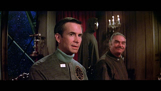
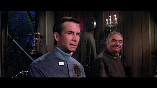
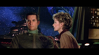
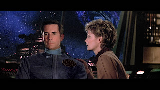
By far the most egregious issue which has plagued my viewing is the constant shift in Anthony Perkins' outfit colour. Given the options available I have no notion of why the costume department would choose blue for a movie which would feature so much blue screen work, but there you have it. As a result you will notice his outfit shift towards teal on occasion. To establish the correct tone I needed to find a scene which showed his outfit as intended, which meant finding a scene which wasn't compromised by blue screen. There are a few so I was in luck. Here's one:


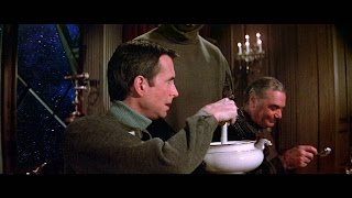
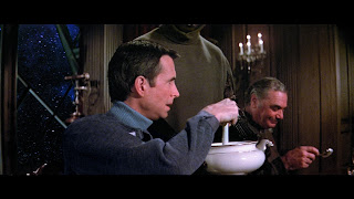
Below are before/after samples of some of the corrective work. I expect this was something which would've been easier to do with the full version of DaVinci - the team at Blackmagic Design actually released a more helpful masking feature in the paid version even as I was working on the project. As it was I had to make a lot of semi-automatic selections and this probably made the process a whole lot more protracted than it had to be. In spite of this the results turned out pretty decently if I say so myself. Sometimes the process required exclusive focus on his outfit within the scene; often it was through a combination of isolation and some general scene colour correction.


I eyeballed the colour correction from scene to scene, but that was assisted by backtracking and applying the same correction across shots within each scene for an acceptable level of continuity. Thus broadly ends the ballad of the teal outfit. This has plagued me since I first managed to get a few repeat viewings under my belt back in the 80's and it's now a more comfortable experience.


MATTES, MATTES, MATTES

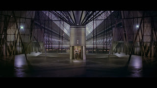
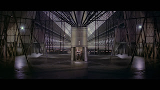
Beyond this it was just matte work, which at times was VERY minimal, to the degree that it's likely only the pedantic side of me that sees the difference and so I won't labour the point with too many examples. There are some however which were pretty significant and worth covering.

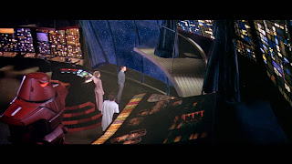
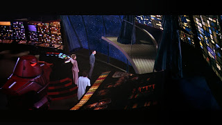
The first was a surprise contrast mismatch and I'm still at a loss as to how they managed to miss this one since it was actually okay on the DVD (!?). It was relatively easy to correct but a mystery as to how it happened in the first place. Since the whole aesthetic of the scene is more towards the "shadowy dark" I opted to use the starfield surround as the base and bring the Cygnus and black hole into its contrast range rather than raising the floor to match the ship.


This next one was a bit of a poser since it involved finding an approach to tackling a section of the screen in the room beyond (it's not green in the scene which follows.. at least it isn't now for my copy since it's not green in the rest of the film). The characters both cross over it and was one of the scenes which again involved Anthony's outfit! In the end I used a combination of general correction and a very soft mask in the middle which allowed for manual stripping and smoothing of the green elements - fortunately that played into some of the teal adjustment for Anthony. 


More unforgiving blue screen combination work, this time on the air car. My main focus on this was contrast work to help coax the background effects elements and live actors together, but again the scourge of the blue outfit demanded a little additional effort..


I believe this next one was the first scene I played with when I began to consider my options for matte adjustments. It became a bit of a litmus test on how well DaVinci could handle adjustments which required finesse and couldn't count on a convenient sharp edge to hide any discrepancies. In the end it worked out pretty well and set the bar for subsequent scene adjustments. Again, a very slight but noticeable balance to bring the green/yellow shift in the live action footage into the cooler toned effects layers and mattes.


I believe the film generally held a yellow cast as a result of the film stock of the era. I suppose this can be considered to be either a nostalgic quality or a sign of age, now we have digital or otherwise more neutral film stock. To that end I expect any remastering of material from around that era can be considered either heresy or a remaster.. I noticed the recent 4k anniversary release of ALIEN for example has the best colour master I've ever seen for that film when compared to on set shots. That film has ranged from warmer yellows and greens through to cold blues across various releases - I expect since they made the effort for 4k with it's 10-bit HDR colour grade that it's reasonable to assume this is the "correct" cast. To that end since ALIEN and THE BLACK HOLE are from the same time I opted to consider the on set photo stock to be the "grade", although the film does maintain a certain yellow tinge anyway owing to the creative set lighting of the Cygnus, which makes it a bit of an uneven bunny to handle.

Again the next shot called for a very soft and broad brush stroke to bring the subtlety needed. None of the blending is really perfect, but for me if it gets you closer to a shot which looks relatively natural then it's probably a job well done - after all when you watch the film you don't see it when with a side by side comparison. As an aside a great example of a film which succeeds with its effects shots is GONE GIRL. Not a film known for its special effects, you'd be surprised how many and where they are!


This next one is one I'm still fighting with. The shift in temperature and colours between the preceding shot of Reinhardt walking in front of colourful control consoles and this one is unfortunate, and I suspect almost impossible task to balance but taken as an isolated shot the cast difference between corrected and blue screen compensation is pretty clear. Thankfully it's a combination of quick shots. Again Alex does teal! I think I need to work on this some more though since Harry's top has lost its warmth. It's a difficult shot to balance against the background.


A few more subtle touches.. The matte in the top right of the bridge walk scene introduces a touch of tonal balance to better seat the live action shot.


The next was an effort to balance the matte shots for Rob Forster's journey back to the Palomino. It's a pretty complicated combo of pieces to join together and again quite tricky to refine but it balances out reasonably well.

The pallbearer shot following this brings the contrast of the background into better relief and is typical of the kinds of tone adjustments for matte elements.


Of all the shots I've worked on the following was satisfying! Again there's more work to be done to get it perfect, not least of all because Maximilian Schell steps behind a matte overlay at the end of the shot. This could be corrected with a CGI overlay as they did with the re-rendering of Spock on Vulcan for the director's cut of STAR TREK THE MOTION PICTURE, but I suspect it's a bit beyond what I can achieve with the free version of Resolve and is only a momentary thing. For the scene as a whole though toning it in was a delight. If anything I may even be able to push it a bit further..? Maybe next time around.


This sequence was a good example of an attempt at film damage restoration. Here we get what looks like exposure damage of some kind, with the blacks losing out to a blue cast, which just jars against the sombre low key yellow light of the scene. This is a lesser success of all the work I've tried but it has been improved to some degree, and at the level I'm working at I'll call it a win.  


The most contentious and difficult sequence to work with throughout the whole project is the shooting gallery. This is absolutely mired in blue screen issues and apparent film damage from start to finish and I'd have to guess there's a fair amount on the actual master. I'm still struggling with this overall sequence and I think it doubtful that I can correct everything satisfactorily with what I have to work with. That said there was one thing which to me was a very forgivable thing given the crunch the effects crew were working under, but something which was I also couldn't "unsee", although I honestly never expected to be able to do anything to correct it.


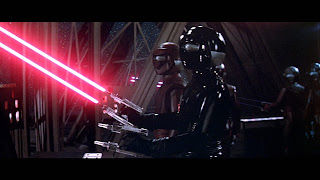
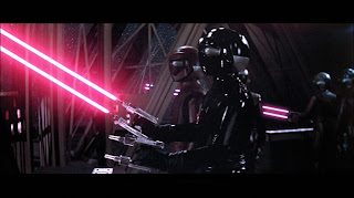
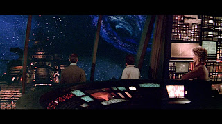
 When BOB is chatting to VINCENT about STAR being the prototype, I noticed one day that one of the animators missed a couple of trace lines for the laser shots in the background. The tail end of the shots exists in two camera shots, but not at the barrel end of the deal (see first image). This is the first of the two quick sequential camera shots. I was very happy to discover how to overlay some laser light onto the scene in the "Fusion" tab of DaVinci, using the principle of lightsaber creation as a means to re-creating the effect. These are just stills but watching it in context honestly you'd never know it now, so that was a pretty big win.

Another interesting tweak was an artificial depth of field issue. Here the starfield is in focus where the rest of the ship, much closer to the camera, is out of focus. That proved to be easy to correct here and in a couple of other scenes, ironically on this same set at another point in the film. I don't think I've tackled them all, but this and an earlier one with Durant and Booth are the ones which I tended to notice the most.


Another couple of blinders, the latter arguably more so than this first. Here we have another matte/live action blend which brings the colours and lighting of the set together. This was a satisfying one to tackle.


This second one was interesting. Just a moment which you may not notice in context but the far end of the central corridor is a terrible continuity match, unless again like the earlier "shadowy Cygnus" shot there was a quirky mismatch which happened? I'd never seen this before I got to see the film in widescreen again since this section of the shot was logically cropped out of the "pan and scan" editions. Maybe it was supposed to be lit differently, or they were creating it based upon the lighting from the previous sequences which were darker grey. Not so when you get to this actual shot here though.. so I took the time to try and better match that too.


More colour correction and tonal adjustments. The Cygnus took on a very green hue in the two shots comprising this scene. I think this one was another shot which may have suffered in the bluray transfer? I'm basing that only on memory but I don't recall it looking this stark on the DVD? Maybe it did.. 


With this one I tried to tone the Palomino in a bit better which was quite an intricate job since the crew are in front of it and moving a bit as the shot unfolds.


Another quick shot where the blue screen/backlighting may have caused some issues, I toned the yellow/green cast in Schell's hair down drastically, helping to emphasise the exterior environment.

 
A fair number of shots suffer in this way. Overall you'd think the film terrible with the "slice and dice" edit work I've put into this, but really no one can blast them for aspects such as this since so many of these kinds of issues were side effects of the film technology they were labouring with. Nothing was as exacting as it is now, and as a fan of the film this whole project is as much about me laying some TLC and gaining some insights into film editing, colour correction and processing, using a beloved film for practice.


EXTRA FLOURISHES

Beyond any of this I did make a handful of personal "tweaks" which I felt like playing with as a means of both satisfying curiosity and tightening things up.

OPENING TITLES
I elected to layer the audio from the CD with the original film soundtrack as a means to additively brightening the tone, since I've always felt that the track sounded a bit lacking in "top end", and I couldn't get a nice quality from just EQ'ing it.

MY INSTINCTS ARE AGAINST IT ALEX
When Holland suggests to Alex his instincts are against the wisdom of going towards the Cygnus, there's a music cue edit which isn't present on the film. I took the liberty of reinserting it to match up with the music when it does arrive in the following scene where the Palomino is firing towards the Cygnus and the looming black hole.

STAR'S DEFEAT
I tightened up the edit of STAR having his breakdown.. just a subtle trim which keeps the mirth without it being quite so laboured.

HE'S FROZEN.. HELP ME WARM HIM!
When the ill-fated crew escape the collapse of the garden environment, Kate closes the scene exclaiming that Bob's frozen. In a recording that I found she asks Holland to help her warm him.. then I noticed that when you look at the scene with that line in place, Yvette does indeed seem to say that line - with the sound removed it's not really noticeable. If you put it back in, you see it!

MAX vs VINCENT
When Max sets about electrocuting VINCENT with his drill-less appendages, I made an edit to take out VINCENT's "moment for the kids" and have him go directly to his counter attack, tightening it up and keeping the aggression of the confrontation on point.

INTO THE HOLE
Whilst I obviously cannot provide a full version of the film I did post the end sequence edit for reasons of demonstration elsewhere, and as such I can pop it in here.. You Tube compression notwithstanding.. the master is better I promise (I hope those forces out there don't mind this existing..).


Another musical cue and this one is a personal thing.. When I got a copy of the album soundtrack way back in the day, this was as for many people the only way to relive the movie until it got a showing on TV. With only the album to rely upon I got it into my head that the opening cue from this titled piece was in the movie, and those heavy, haunting drums and strings formed the backbone of the horror I thought I remembered and felt in that moment in the cinema. Imagine my surprise when I discovered that it wasn't in the movie, and only started when we pull back from the dizzying image of Kate's eye.. (I also could've sworn that the escape from the power centre was still in the movie too, but that's another matter and one continuity which I sadly can't correct). So I elected to put that "back in", even adding an extra shot of the probe ship flying into the hole (creatively tweaked with colour to assist in blanketing any repetition), breaking up the shot between Holland's cry and VINCENT's thoughts and buying enough time in the overall sequence to allow the musical cue to exist.

SO this is my pet project which is helping me to learn about all manner of aspects of editing and production. It's a testament to the movie that in spite of its critical blasting there is something about this movie which has kept it as a personal favourite for over forty years. As I've said elsewhere I believe this movie is best enjoyed as a fantasy experience. Leave science at the door when you enter this one in much the same way as you would leave rationale at the door when you appreciate a piece of abstract art. It isn't about what you see and how realistic it is.. it's about how you feel as you're chaperoned through a story of a haunted, gothic spacecraft on the precipice of danger, delivered into the panic of primal survival and fear of the unknown.